Moser Pilon Nelson Architects Launch New Website
August 25th, 2016
Moser Pilon Nelson Architects launched their new website this week with the help of SoSimple Interactive.
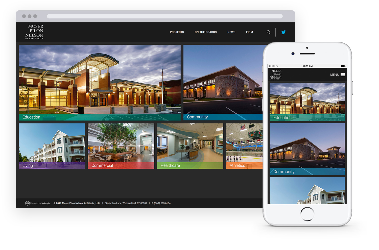
The homepage features a block layout of clickable images that direct the user to various “Project” pages containing categories of projects the company has completed. These link images lead the user to robust photo galleries of each project accompanied by background information and project narratives.
Under the “Project” page, users can browse the company’s “Full Project List,” a page containing all projects that the client has completed to date. The page features a category filtering system, allowing users to choose a specific category to browse. The list contains links to project photo galleries available on the website.
The website’s “Team” page utilizes a link image grid page type, featuring images of the company’s principals. Once clicked, the user is brought to a separate page containing the individual principal’s biography and contact information. These individual pages are set up utilizing SoSimple CMS’ 50/50 responsive page template.
The new site features a dark grey background throughout, paired with light blue accents found in links and buttons, making it visually captivating and unique from most other websites.
For mobile users, the new website includes responsive, mobile-optimized design, including SoSimple CMS’ recently updated responsive page layouts throughout the site, allowing the site to automatically reformat to ensure that content is always displayed in an optimal manner across all viewing platforms - desktop, tablet or smart phone.


